

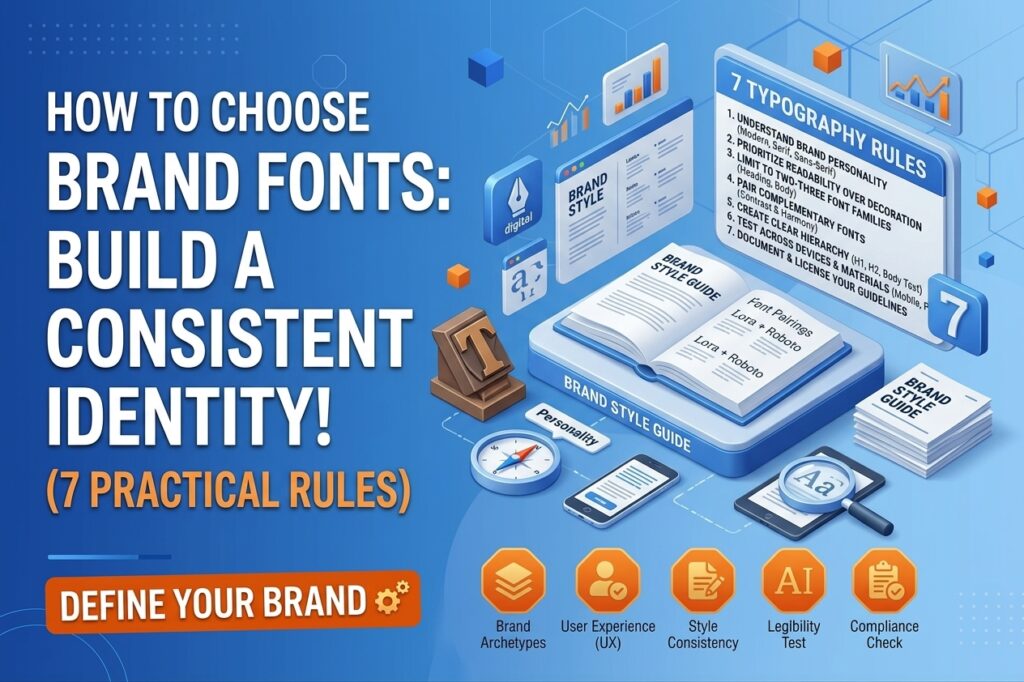
How to Choose Brand Fonts
Choosing the right brand fonts is an important part of building a recognizable business identity. Typography influences how customers perceive your brand, how easily they read your content, and how consistently your business appears across websites, social media, marketing materials, and printed designs.
For small businesses, choosing fonts does not have to be complicated or expensive. You can create a professional visual identity by selecting readable typefaces, combining fonts carefully, and using consistent typography across your marketing channels.
In this guide, you will learn how to choose brand fonts using seven practical typography rules.
Why Are Brand Fonts Important?
Brand fonts help communicate your business’s personality and make your visual identity more consistent. For example, a traditional serif font may create a classic, established impression, while a clean sans-serif font can feel modern and straightforward.
Consistent typography also helps customers recognize your business across different platforms. When your website, business cards, social media graphics, and brochures use the same font system, your brand can appear more organized and professional.
However, attractive fonts alone cannot build a strong brand. Your typography should support your message, audience, and overall design strategy.
1. Understand Your Brand Personality
Before choosing fonts, define how you want customers to perceive your business.
Ask yourself whether your brand should feel modern, friendly, elegant, playful, trustworthy, or traditional. Your answers will help narrow down suitable font styles.
For example:
- Modern and minimal: Clean sans-serif typefaces.
- Elegant and premium: Carefully selected serif typefaces.
- Friendly and approachable: Rounded or humanist sans-serif fonts.
- Traditional and established: Classic serif fonts.
- Creative and expressive: Distinctive display fonts used selectively.
These are starting points rather than strict rules. Evaluate each font in the context of your brand’s audience and visual identity.
2. Choose Readability Over Decoration
A font may look attractive in a design preview but become difficult to read in real-world use. Small businesses need typography that works across website pages, advertisements, emails, and mobile screens.
Check how a font looks at different sizes. Pay attention to letter spacing, character shapes, line spacing, and the distinction between similar letters.
Decorative fonts can work well for short headings or occasional design elements. For paragraphs, product descriptions, and other longer text, prioritize clear and readable typefaces.
Practical tip: Test your selected fonts in an actual website layout instead of evaluating them only in a font preview.
3. Limit Your Brand to Two or Three Font Families
Using too many unrelated fonts can make a design feel inconsistent. Most small businesses can build a practical typography system with two font families.
A simple combination might include:
- Heading font: A distinctive typeface for page titles and section headings.
- Body font: A highly readable typeface for paragraphs and descriptions.
- Optional accent font: A special typeface for occasional promotional graphics or short highlights.
You do not always need a third font. Different weights, such as regular, medium, semibold, and bold, can create hierarchy without introducing another typeface.
4. Combine Fonts That Complement Each Other
Font pairing is about creating contrast while maintaining visual harmony. Two fonts that look almost identical may not provide enough distinction, while two highly decorative fonts may compete for attention.
A useful starting point is pairing a serif heading font with a sans-serif body font. You can also combine two sans-serif families if their proportions and personalities work well together.
Examples of combinations to test include:
- Playfair Display + Open Sans: A classic heading style with clean body text.
- Montserrat + Open Sans: A modern heading style with straightforward paragraph text.
- Lora + Roboto: Traditional-looking headings paired with a practical sans-serif.
These are examples, not universal recommendations. Test font weights, spacing, and readability before making a final decision.
5. Create a Clear Typography Hierarchy
Typography hierarchy helps readers understand which information matters most. A well-organized design makes it easy to scan a page and identify headings, supporting information, and body text.
Establish consistent styles for:
- H1: The main page title.
- H2: Major sections.
- H3: Subsections.
- Body text: Main paragraphs.
- Buttons and labels: Short interface text and calls to action.
For a website, you might begin with a larger H1, moderately sized H2 headings, and comfortable body text. Adjust the sizes according to the design, device, and content.
Use font size, weight, spacing, and contrast together rather than relying on size alone. Keep the hierarchy consistent across pages so visitors can navigate your content more easily.
6. Test Fonts Across Devices and Marketing Materials
Your brand typography should work wherever customers encounter your business. A font that looks excellent on a desktop monitor may be difficult to read on a small smartphone screen.
Test your typography on:
- Desktop and mobile website pages.
- Social media graphics.
- Business cards and brochures.
- Email newsletters.
- Presentations and promotional materials.
Check that headings wrap naturally, paragraphs remain readable, and important information is not crowded. Also consider whether the selected fonts support the characters and languages your business needs.
For websites, check font loading performance and use suitable font formats and weights. Loading too many font files can affect page performance.
7. Document Your Typography Guidelines
Once you have selected your brand fonts, document the rules so you and your designers can use them consistently.
Your typography guidelines should include:
- Font family names and approved alternatives.
- Heading and body font assignments.
- Recommended font weights and sizes.
- Line-height and letter-spacing guidance.
- Rules for buttons, captions, and promotional graphics.
- Licensing requirements and permitted usage.
Store the guidelines alongside your logo, color palette, and other brand assets. This makes future design projects easier and reduces the risk of inconsistent typography.
Before using a font commercially, check its license and the terms for the platforms where it will appear. Do not assume every free font permits every type of commercial use.
Common Brand Font Mistakes to Avoid
Even a good font selection can lose its impact when applied inconsistently. Avoid these common mistakes:
- Choosing a font only because it is currently trending.
- Using decorative typefaces for long paragraphs.
- Combining too many font families.
- Making body text too small.
- Using inconsistent heading styles across pages.
- Ignoring mobile readability.
- Overlooking font licensing and language support.
The goal is not to use the most unusual font. It is to choose typography that communicates your brand’s personality while remaining clear and practical.
Conclusion
Learning how to choose brand fonts helps small businesses create a more consistent and recognizable visual identity. Start by defining your brand personality, prioritize readability, choose a limited number of complementary fonts, and establish a clear hierarchy.
Then test your typography across devices and marketing materials before documenting your final choices. A simple, well-managed font system can support your website design, social media presence, and broader branding efforts without making every design project more complicated.
Explore More..