

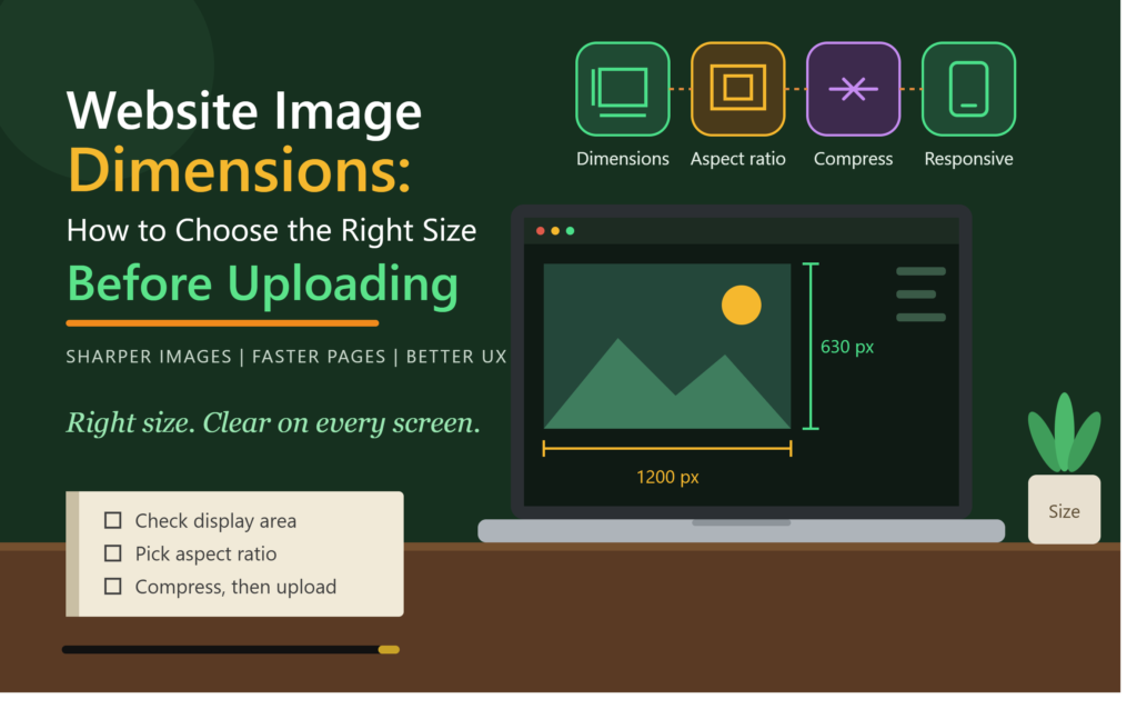
Choosing the right website image dimensions is an important step in creating a professional, fast, and user-friendly website. Images that are too small may look blurry, while oversized images can increase page loading time and affect the browsing experience. Before uploading an image to WordPress or another website platform, it is important to understand how image width, height, aspect ratio, and file size work together.
Whether you are designing a homepage banner, publishing a blog post, or adding product images to an online store, the right image dimensions help your visuals look clear across different screen sizes.
What Are Website Image Dimensions?
Website image dimensions refer to the width and height of an image, usually measured in pixels. For example, an image measuring 1200 × 800 pixels is 1200 pixels wide and 800 pixels tall.
The first number represents the width, and the second represents the height. These measurements determine an image’s shape and the amount of visual detail it can display.
Image dimensions are different from file size. Dimensions describe the image’s pixel measurements, while file size indicates how much storage space the image requires, usually measured in KB or MB.
Both matter when preparing images for a website. You need enough pixels for a clear display without uploading unnecessarily large files.
Why Do Website Image Dimensions Matter?
Selecting suitable image dimensions can improve several aspects of your website.
1. Improve Visual Quality
Images with insufficient dimensions may appear blurry or pixelated when displayed in larger areas. Using appropriately sized images helps maintain clarity on desktop computers, tablets, and smartphones.
2. Support Faster Page Loading
Large images can contain more data than a page needs. If an image is much larger than its displayed size, optimizing its dimensions and compression can reduce the amount of data visitors need to download.
This can support better loading performance and contribute to a smoother user experience.
3. Create a Consistent Website Layout
Using consistent image dimensions for similar content helps maintain alignment and visual balance. For example, blog cards with consistent aspect ratios create a more organized appearance than cards containing images with unrelated shapes.
4. Improve Mobile Responsiveness
An image that looks appropriate on a desktop may not fit well on a smaller screen. Responsive layouts allow images to adjust to available space, but the original image must still have suitable dimensions and composition.
Recommended Website Image Dimensions
There is no single image size that works best for every website. The appropriate dimensions depend on the design, display size, and purpose of the image.
The following measurements are practical starting points rather than universal requirements.
| Image Type | Suggested Dimensions | Aspect Ratio |
|---|---|---|
| Blog featured image | 1200 × 630 px | 1.91:1 |
| Blog content image | 1200 × 800 px | 3:2 |
| Website hero banner | 1920 × 800 px | 2.4:1 |
| Square product image | 1000 × 1000 px | 1:1 |
| Logo | 500 × 200 px | 2.5:1 |
| Small thumbnail | 400 × 300 px | 4:3 |
| Social sharing image | 1200 × 630 px | 1.91:1 |
These recommendations should be adjusted to match your website theme, content management system, and actual display requirements. A logo, for example, may need a different aspect ratio depending on its design.
How to Choose the Right Image Dimensions
Choosing the right image size becomes easier when you follow a consistent process.
Step 1: Check the Display Area
First, identify where the image will appear. A full-width homepage banner needs different dimensions from a small thumbnail or an image inside a blog paragraph.
Check the width of the content area and the maximum size at which the image will be displayed. This helps you avoid preparing images that are unnecessarily large or too small.
Step 2: Select the Correct Aspect Ratio
An aspect ratio describes the relationship between an image’s width and height.
For example, a 1200 × 800 image has a 3:2 aspect ratio, while a 1000 × 1000 image is square.
Choose a ratio that suits the design. Landscape images often work well for blog posts and banners, while square images are commonly used for product listings and profile graphics.
Avoid stretching an image to force it into a different shape. Crop it carefully instead.
Step 3: Consider High-Resolution Screens
Images may appear larger or sharper on high-resolution displays. For a full-width image displayed at 1200 CSS pixels, a source image with a width of around 2400 pixels may provide additional detail on a 2× pixel-density display.
However, larger source files also require more data. Use appropriately sized responsive image variants when possible rather than serving the largest file to every visitor.
Step 4: Compress the Image
After selecting the dimensions, optimize the file size. Image compression reduces the amount of data an image contains and can improve loading performance.
Modern formats such as WebP and AVIF can often provide smaller files than JPEG or PNG at comparable visual quality. Choose the format according to the image type and your website’s compatibility requirements.
Step 5: Preview the Image on Different Devices
Before publishing, preview the page on desktop, tablet, and mobile screens. Look for unwanted cropping, distorted proportions, blurry details, and images that extend beyond the content area.
Make adjustments before uploading or publishing the final version.
Best Website Image Dimensions for WordPress
WordPress generates multiple image sizes when you upload an image, depending on your settings, theme, and plugins. These can include thumbnail, medium, large, and additional theme-specific sizes.
For example, you might upload a 1600-pixel-wide image and use a smaller generated version in a blog card while displaying a larger version inside the article.
To manage image dimensions effectively:
- Check your theme’s recommended featured image dimensions.
- Review Settings → Media for the default image size settings available in your WordPress installation.
- Use responsive image features so browsers can select a suitable image source.
- Avoid uploading unnecessarily large original images.
- Check whether your theme or plugins generate additional image sizes.
If you use WordPress regularly, understanding WordPress SEO can also help you manage image-related technical considerations alongside your wider optimization workflow.
Common Mistakes to Avoid
Even a well-designed image can cause problems when its dimensions or format are unsuitable.
Uploading images that are too small: Small images may become blurry when enlarged.
Using oversized images everywhere: Serving a huge image in a small card can waste bandwidth and slow down the page.
Ignoring aspect ratios: Inconsistent image shapes can make product grids and blog layouts look untidy.
Stretching images: Changing width and height independently can distort people, objects, and graphics.
Forgetting mobile users: Images should remain clear and fit the available space on smaller screens.
Focusing only on dimensions: A correctly sized image can still be slow if its file size is excessive. Dimensions, compression, format, and responsive delivery should work together.
Tools to Help You Resize Website Images
Several tools can help you prepare images before uploading them.
- Canva: Useful for creating banners, thumbnails, and social graphics with custom dimensions.
- Adobe Photoshop: Provides detailed control over cropping, resizing, and export quality.
- GIMP: A desktop image editor for resizing and editing images.
- Squoosh: A browser-based tool for resizing and compressing images in supported formats.
- WordPress media tools: Useful for managing uploaded images and selecting generated image sizes.
When choosing Graphic Design Tools, consider whether you need simple resizing, advanced editing, or image compression. The best option depends on your workflow and the type of visuals you create.
Conclusion
Choosing the right website image dimensions helps maintain visual quality, consistent layouts, and efficient image delivery. Start by checking the display area, select an appropriate aspect ratio, resize the image to a suitable resolution, and compress it before uploading.
For WordPress websites, also review your theme’s image requirements and use responsive image features where possible. These steps help you create a more professional browsing experience without unnecessarily increasing page loading time.
Explore More..