

Good graphic design is not only about choosing attractive colors, fonts, and images. The way elements are positioned and sized can have a major impact on how people perceive a design. One mathematical principle that designers can use to create balanced and visually appealing compositions is the Golden Ratio in graphic design.
The Golden Ratio has been used in art, architecture, photography, and design for centuries. In graphic design, it can help designers create proportions, layouts, typography, and visual relationships that feel naturally balanced.
But what exactly is the Golden Ratio, and how can you use it in your designs?
Golden Ratio in Graphic Design
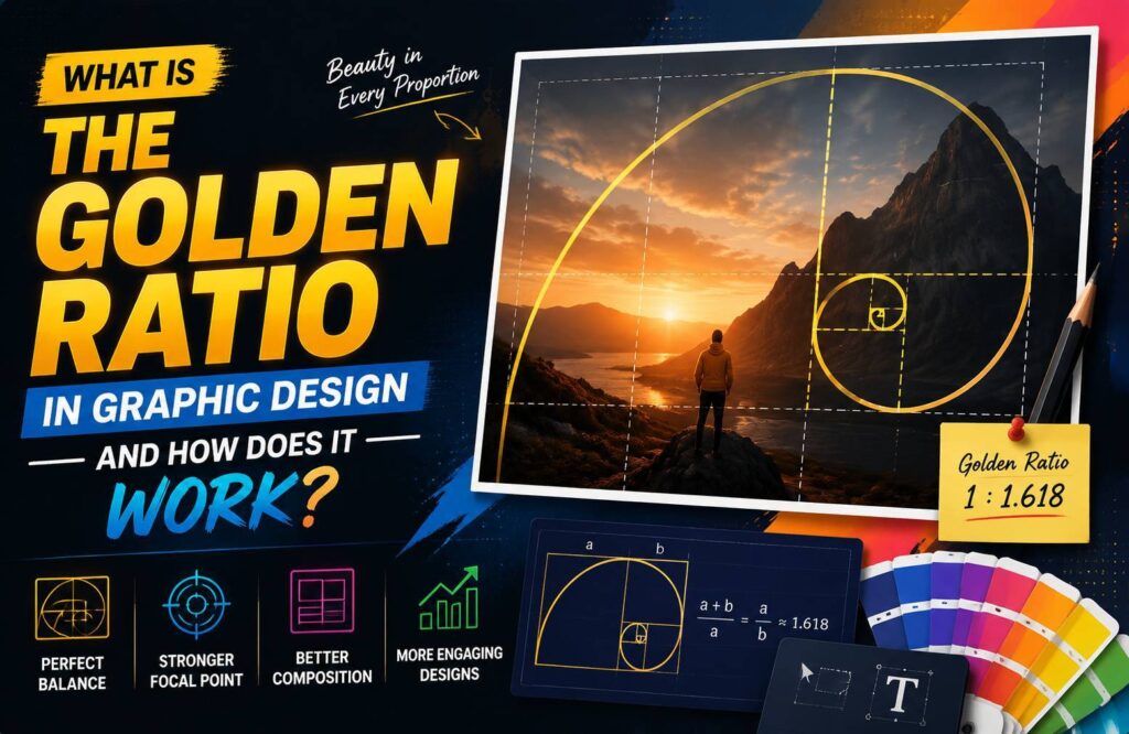
The Golden Ratio is a mathematical proportion represented by the Greek letter φ (phi). Its approximate value is 1.618.
The ratio occurs when two quantities have a relationship in which the ratio of the larger quantity to the smaller quantity is the same as the ratio of their combined total to the larger quantity.
In simple terms, the Golden Ratio provides a proportional relationship that can be used to divide space or determine the relative size of design elements.
The ratio can be expressed approximately as:
1 : 1.618
For graphic designers, the important idea isn’t the mathematics itself. The practical value comes from using this proportion to create relationships between different elements of a composition.
Why Is the Golden Ratio Useful in Graphic Design?
Graphic design involves many decisions about size, spacing, positioning, and hierarchy.
A designer might need to decide:
- How large should a headline be?
- How much space should an image occupy?
- Where should the main visual element be positioned?
- How should a page be divided?
- How large should one section be compared with another?
The Golden Ratio can provide a useful starting point for making these decisions.
It can help create visual balance, hierarchy, proportion, and harmony without requiring designers to rely entirely on guesswork.
How Does the Golden Ratio Work?
The Golden Ratio can be applied by creating proportions between different elements.
For example, imagine a website layout divided into two sections. Instead of making both sections exactly the same width, you could use a larger content area and a smaller sidebar based on a proportional relationship.
The same principle can be applied to:
- Image sizes
- Columns
- Typography
- Margins
- Spacing
- Logos
- Illustrations
- Website layouts
The Golden Ratio is not a strict rule that every design must follow. It is better viewed as a design tool that can help establish relationships between elements.
The Golden Ratio in Layout Design
One of the most practical uses of the Golden Ratio is creating layouts.
Suppose you have a large content area and a smaller supporting area. Rather than dividing the page randomly, you can use Golden Ratio proportions as a starting point.
For example, a page could have:
- A large primary content section
- A smaller supporting section
- Proportional spacing between major elements
This can create a more natural visual relationship between different areas of the design.
However, usability should always come first. A mathematically proportional layout isn’t automatically a good layout. Designers should also consider content, screen size, accessibility, and user behavior.
Using the Golden Ratio for Typography
The Golden Ratio can also help establish relationships between font sizes.
For example, if your body text is 16px, multiplying it by approximately 1.618 gives a value close to 26px.
This could provide a starting point for a larger heading.
You don’t have to follow the exact number. Designers can round values to practical sizes that work well within the design system.
For example:
- Body text: 16px
- Subheading: around 24-26px
- Main heading: around 40px
The purpose is to create a noticeable difference between text levels while maintaining a harmonious relationship.
Typography should still be tested for readability across different devices.
Golden Ratio and Visual Hierarchy
Visual hierarchy determines which elements people notice first, second, and third.
Size is one of the strongest ways to establish hierarchy.
A designer can use proportional differences between headings, images, buttons, and other elements to guide attention.
For example, a large headline can attract attention first, while smaller supporting text provides additional information.
The Golden Ratio can help designers establish these size relationships in a more structured way.
The Golden Spiral
One of the most recognizable visual applications of the Golden Ratio is the Golden Spiral.
A Golden Spiral can be created using a sequence of rectangles based on Golden Ratio proportions. When arcs are drawn through the resulting sections, they create a spiral-like shape.
Designers can use the concept as a visual guide for positioning important elements.
For example, a composition could place the main subject near the focal area of the spiral while supporting elements follow its flow.
This can be particularly useful in:
- Poster design
- Photography
- Editorial layouts
- Website hero sections
- Illustrations
- Advertising graphics
The Golden Spiral is a guide rather than a requirement. Strong compositions can be created without using it.
Golden Ratio in Logo Design
The Golden Ratio is sometimes associated with logo design because designers can use proportional relationships when constructing shapes.
Circles, rectangles, curves, and other geometric elements can be arranged according to consistent proportions.
This can help create a logo that feels structured and balanced.
However, not every successful logo is based on the Golden Ratio. A memorable logo depends on many factors, including simplicity, distinctiveness, scalability, and relevance to the brand.
Designers should avoid forcing mathematical proportions into a logo simply because they are associated with good design.
Golden Ratio in Web Design
The Golden Ratio can also be used as a starting point for website layouts.
For example, designers can experiment with proportional relationships between:
- Main content and sidebar
- Text and images
- Hero sections and supporting content
- Headings and body text
- Content blocks and whitespace
This can help create a visually balanced interface.
However, modern web design must also consider responsive behavior. A layout that works well on a desktop screen may need to change significantly on mobile devices.
Therefore, the Golden Ratio should support responsive design rather than replace it.
Golden Ratio vs Rule of Thirds
The Golden Ratio and Rule of Thirds are both composition techniques, but they are not identical.
The Rule of Thirds divides a composition into nine equal sections using two horizontal and two vertical lines. Important elements are often positioned near the intersections.
The Golden Ratio uses a proportion of approximately 1:1.618.
The Rule of Thirds is generally simpler to apply, while the Golden Ratio provides a more specific proportional relationship.
Both can be useful depending on the design.
Benefits of Using the Golden Ratio
Using the Golden Ratio can provide several benefits when applied appropriately.
Creates Visual Balance
Proportional relationships can help prevent elements from feeling randomly sized or positioned.
Supports Visual Hierarchy
Different sizes can guide the viewer’s attention toward important information.
Provides a Starting Point
The Golden Ratio gives designers a practical framework when deciding proportions.
Helps Create Consistency
Using consistent proportions across different elements can make a composition feel more organized.
Encourages Better Composition
Thinking about relationships between elements can help designers become more intentional about layout decisions.
Common Mistakes to Avoid
The Golden Ratio graphic design is useful, but it shouldn’t become a rigid design rule.
One common mistake is forcing every element to follow the 1:1.618 proportion. This can make a design unnecessarily complicated.
Another mistake is prioritizing mathematical proportions over usability. A website should be easy to navigate and read before it is mathematically perfect.
Designers should also avoid assuming that the Golden Ratio automatically makes a design attractive. Good design depends on context, audience, functionality, typography, color, spacing, and many other factors.
How to Apply the Golden Ratio in Your Next Design
If you want to experiment with the Golden Ratio, start with a simple design.
Step 1: Identify the Main Element
Determine the most important element in your composition, such as a headline, image, product, or call-to-action.
Step 2: Establish a Proportion
Use approximately 1:1.618 to create a relationship between your primary and secondary elements.
Step 3: Adjust the Layout
Experiment with the position and size of the elements while maintaining a clear visual hierarchy.
Step 4: Check Readability
Make sure text remains readable and important information is easy to find.
Step 5: Test the Design
Review the design on different screen sizes and make adjustments where necessary.
Conclusion
The Golden Ratio in graphic design is a useful mathematical principle for creating relationships between different elements. It can help designers think more carefully about proportion, hierarchy, layout, typography, and composition.
However, it should be treated as a guideline rather than a strict rule. Great graphic design combines structure with creativity and considers the needs of the audience.
Whether you’re designing a website, poster, logo, social graphic, or editorial layout, experimenting with Golden Ratio proportions can give you another useful tool for creating balanced and intentional designs.