

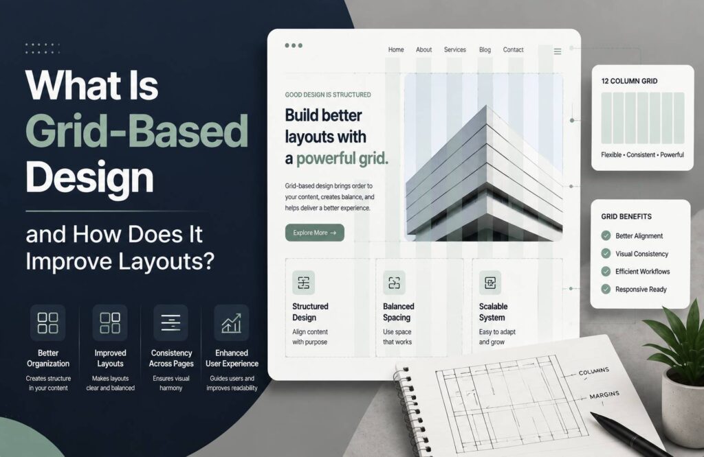
Good graphic design is not only about choosing attractive colors, fonts, and images. How those elements are positioned on a page can have a major impact on how professional, readable, and balanced the final design looks. This is where grid-based design becomes useful.
A grid provides an invisible structure that helps designers organize text, images, buttons, and other visual elements. Instead of placing every element randomly, designers use rows, columns, margins, and spacing to create a consistent layout.
Grid systems are widely used in websites, magazines, posters, brochures, mobile apps, dashboards, and branding materials. They can make complex designs easier to understand while helping maintain consistency across multiple pages.
What Is Grid-Based Design?
Grid-based design is a layout approach that uses a structured system of horizontal and vertical lines to organize visual elements.
The lines of a grid are usually invisible in the final design. They act as guides that help determine where headings, paragraphs, images, cards, buttons, and other components should be positioned.
For example, a website might use a 12-column grid. A large heading could span six columns while an image occupies the remaining six. On another section, a text block might span eight columns and a sidebar four.
The grid does not necessarily mean every element must have the same size. Instead, it creates relationships between elements so the overall composition feels organized.
Why Do Designers Use Grid Systems?
Without a layout structure, a design can easily become difficult to read or visually confusing. A grid gives designers a framework for making positioning decisions.
Some major benefits include:
- Better alignment
- More consistent spacing
- Improved readability
- Stronger visual hierarchy
- Easier responsive design
- Faster layout creation
- Greater consistency between pages
A grid can be especially useful when a project contains many different elements that need to work together.
Common Types of Grids in Graphic Design
There is no single grid that works for every project. Designers choose different grid structures depending on the content and purpose of the design.
1. Manuscript Grid
A manuscript grid is one of the simplest grid types. It generally consists of one large rectangular area surrounded by margins.
This type of grid is commonly associated with books, essays, reports, and long-form reading materials.
The simple structure allows readers to focus on continuous text without unnecessary visual distractions.
2. Column Grid
A column grid divides the page into multiple vertical sections.
It is commonly used for magazines, newspapers, websites, and editorial layouts.
For example, a designer might create a three-column layout where:
- The first column contains an article
- The second column contains supporting content
- The third column contains images or additional information
Column grids provide flexibility while maintaining alignment.
3. Modular Grid
A modular grid combines columns and horizontal rows to create multiple rectangular modules.
This structure is useful for complex layouts containing many independent elements.
Newspaper homepages, dashboards, product catalogs, and image-heavy websites can benefit from modular grids.
4. Hierarchical Grid
A hierarchical grid is more flexible than traditional column or modular grids.
Instead of dividing the page into equal sections, the grid is organized according to the importance of the content.
A large headline might receive more space than supporting text, while a primary image may occupy a larger area than secondary graphics.
This approach is useful when the content itself determines the visual structure.
How Grid-Based Design Improves Layouts
Creates Better Alignment
Alignment is one of the most noticeable characteristics of a professional design.
When multiple elements share common edges or positions, the layout feels more organized.
For example, aligning several headings with the same left edge can create a stronger visual relationship between different sections.
A grid makes these alignment decisions easier because designers can use the same columns and guides throughout the composition.
Improves Visual Hierarchy
A good layout should help viewers understand what to look at first, second, and third.
Grid systems can support this hierarchy by giving important elements more space.
A main headline might span several columns, while supporting information occupies a smaller section. This difference in scale and placement helps communicate importance.
Makes Designs Easier to Read
Poor spacing and inconsistent positioning can make content difficult to follow.
A grid helps create predictable relationships between headings, paragraphs, images, and other elements.
This is especially important for text-heavy designs because consistent margins and column widths can make long content easier to scan.
Creates Consistency
Consistency becomes increasingly important when a project contains multiple pages.
For example, a website may have dozens of pages. If each page uses completely different spacing and alignment, the website can feel disconnected.
A shared grid allows designers to maintain similar proportions and positioning across different pages.
Speeds Up the Design Process
A grid can reduce the number of layout decisions designers have to make from scratch.
Instead of asking where every element should be positioned, designers can work within predefined columns, rows, and spacing rules.
This can make the design process faster, particularly when creating multiple pages or variations of the same layout.
Grid-Based Design in Website Design
Grid systems are particularly important in web design because websites need to work across different screen sizes.
A desktop website might use a multi-column grid, while the same layout can collapse into fewer columns on tablets and mobile devices.
For example:
- Desktop: 12 columns
- Tablet: 6 columns
- Mobile: 1-4 columns
The exact structure depends on the design system and content.
Responsive grids allow designers to maintain relationships between elements while adapting the layout to different screen widths.
Grid vs Layout: What Is the Difference?
A grid and a layout are related, but they are not exactly the same.
A grid is the underlying structure used to organize elements.
A layout is the final arrangement of those elements.
Think of the grid as a framework and the layout as the finished composition built on that framework.
A designer can use the same grid to create several different layouts depending on the content.
Does Every Design Need a Grid?
No.
Grid systems are extremely useful, but they are not mandatory for every design.
Some creative projects intentionally use asymmetrical or freeform layouts. Posters, experimental artwork, advertisements, and artistic compositions may benefit from breaking traditional grid rules.
However, even designs that appear freeform may use an underlying structure to maintain balance.
The goal is not to make every design look rigid. The goal is to create intentional relationships between visual elements.
How to Create a Grid-Based Layout
Creating a grid-based layout can be broken down into several steps.
Step 1: Understand the Content
Before creating the grid, identify what the design needs to communicate.
Determine the important elements, such as:
- Headlines
- Body text
- Images
- Navigation
- Buttons
- Product information
- Supporting graphics
The content should influence the grid rather than forcing the content into an unsuitable structure.
Step 2: Choose Your Grid Type
Select a grid based on the project.
A simple document may require a manuscript grid, while a website or magazine may benefit from a column or modular grid.
Step 3: Set Margins
Margins create space between the content and the edges of the page or screen.
Appropriate margins can prevent a design from feeling crowded and give important elements room to breathe.
Step 4: Define Columns and Gutters
Columns divide the content area into vertical sections.
The spaces between columns are called gutters.
Consistent gutters help create visual separation without requiring visible borders.
Step 5: Place the Most Important Elements
Start with the primary content, such as the main heading, hero image, or primary message.
Then position secondary elements around it according to the grid.
Step 6: Check Alignment
Review the design and look for elements that should share common edges.
Consistent alignment can make a significant difference in the overall appearance of the layout.
Step 7: Test Different Screen Sizes
For digital designs, check how the grid behaves on desktop, tablet, and mobile screens.
A layout that looks excellent on a large monitor may become difficult to use on a small screen if the grid is not responsive.
Common Grid Design Mistakes
Using Too Many Columns
More columns do not automatically create a better design.
An overly complicated grid can make the layout difficult to manage and may create unnecessary visual complexity.
Ignoring Gutters
Columns that are too close together can make content feel crowded.
Gutters provide breathing room between sections and should be considered carefully.
Making Everything Symmetrical
A grid does not require every element to have equal size.
Using different column spans can create stronger hierarchy and visual interest while maintaining structure.
Breaking the Grid Without Purpose
Breaking a grid can be an effective creative technique, but random deviations may make a design look accidental.
If you break the grid, there should be a visual reason for doing so.
Forgetting Responsive Behavior
A desktop grid should not simply be squeezed onto a mobile screen.
Designers need to consider how columns collapse, stack, resize, or reposition at smaller screen sizes.
Grid-Based Design Best Practices
To create more effective layouts, keep these principles in mind:
- Choose a grid based on the content.
- Maintain consistent alignment.
- Use spacing intentionally.
- Give important content appropriate visual weight.
- Keep gutters consistent.
- Test layouts across different screen sizes.
- Do not be afraid to break the grid when there is a clear creative purpose.
- Prioritize readability and usability over decoration.
Conclusion
Grid-based design provides a practical framework for organizing visual content. By using columns, rows, margins, and gutters, designers can create layouts that are easier to understand, more consistent, and visually balanced.
A grid does not have to make a design boring or predictable. Instead, it gives designers a reliable structure that can be adapted, modified, and even intentionally broken when the project calls for creativity.
Whether you are designing a website, magazine, presentation, poster, or mobile interface, understanding grid systems can help you make better layout decisions.